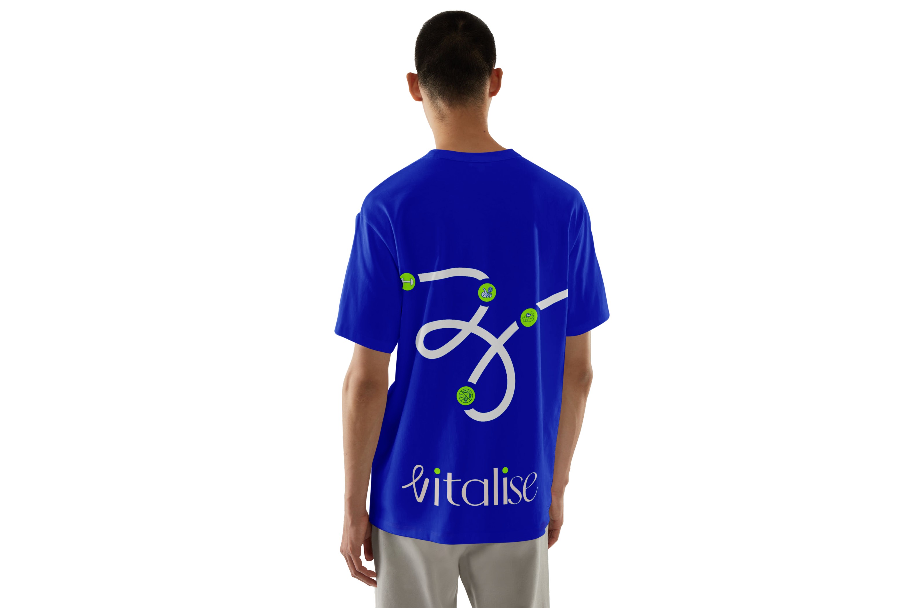


Through strategy workshops and audience mapping, we identified four key personas: Fitness Explorers, The Nomads, Multi-Sport Enthusiasts, and Corporate Executives. Each of them shared a common frustration: rigid systems that didn’t fit their lives. I translated this insight into a flexible identity system built around fluid motion, soft geometry, and a brand thread that flows — literally. The primary logo is inspired by movement and balance, with dynamic dot accents that represent connection and energy. A custom brand palette blends bold momentum blues with energetic pulse greens, paired with a typographic system that balances structure and softness. We designed a motion-first ecosystem, where animated threads guide users through booking sessions across gyms, wellness spaces, and recovery zones — all with intuitive ease.


Vitalise isn’t just a fitness brand — it’s a redefinition of what modern wellness can look like: fluid, motivating, and on your terms. My role was to ensure every touchpoint — from logo to motion to UI assets — reflects that belief. Built by Noun — for the ones who move with purpose.
